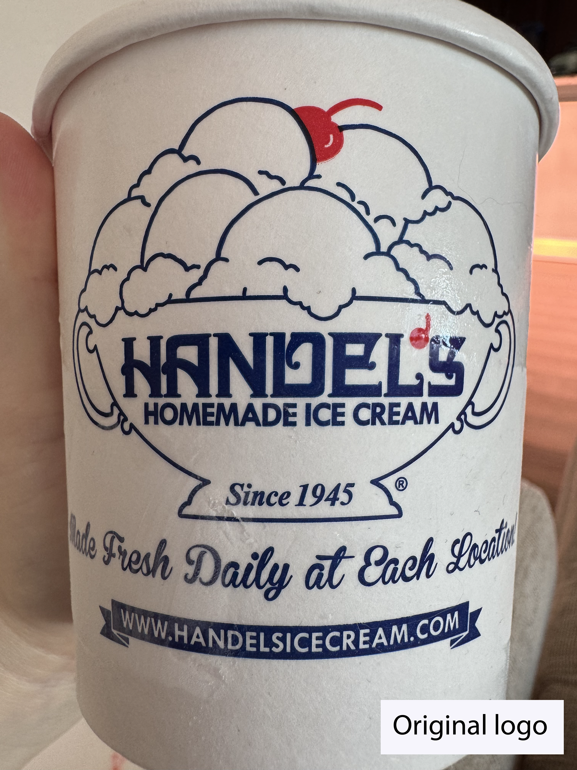
Original Handel's logo
Context
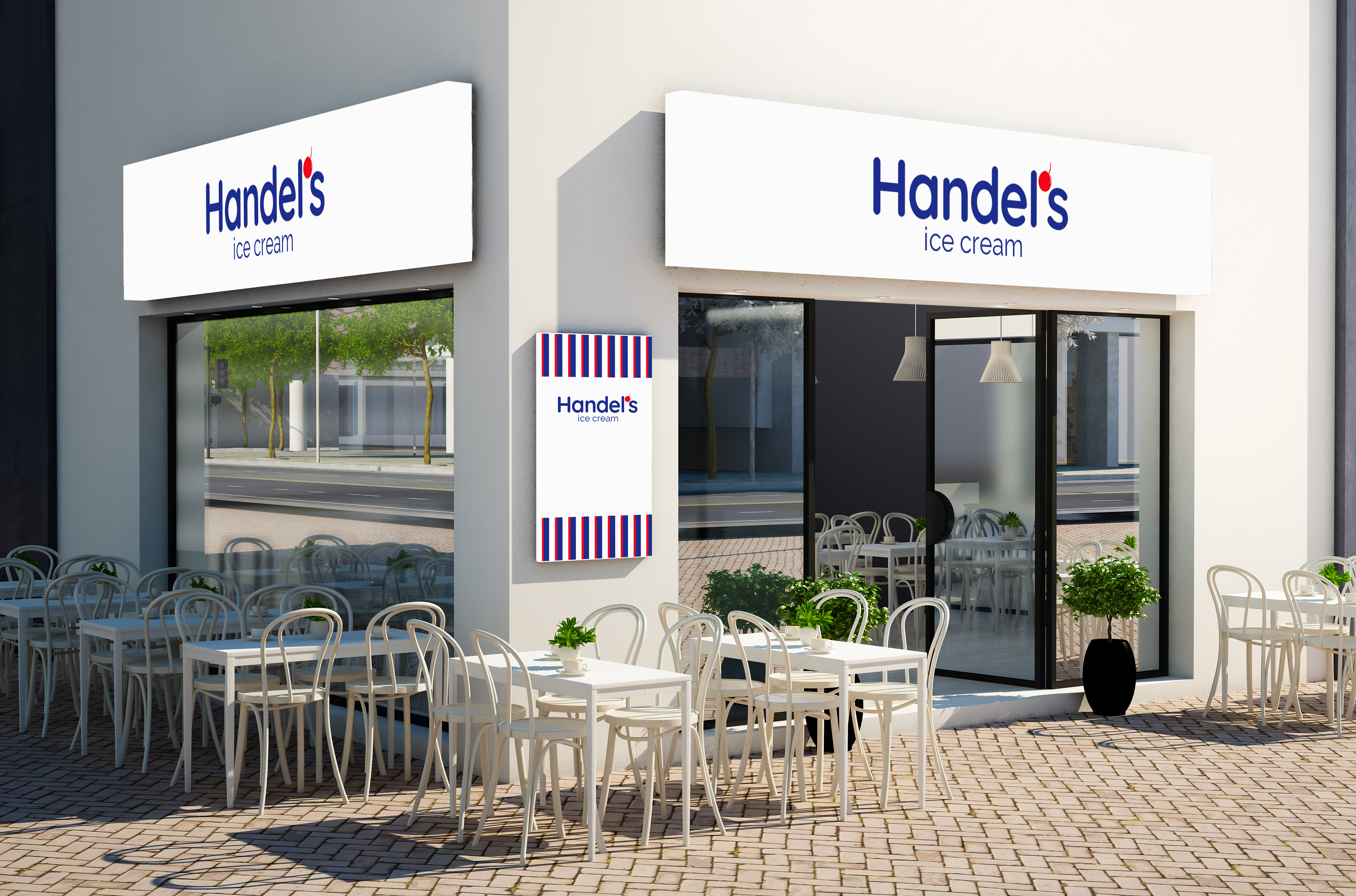
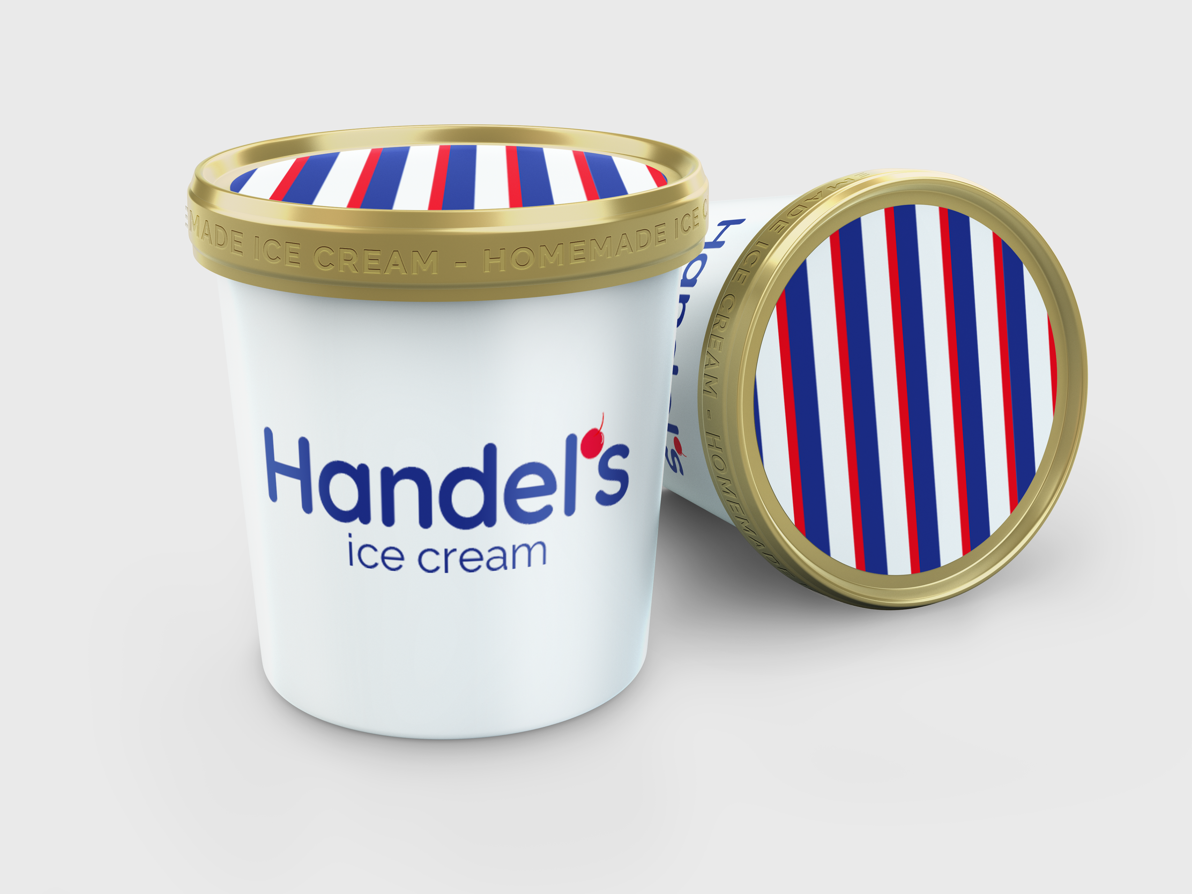
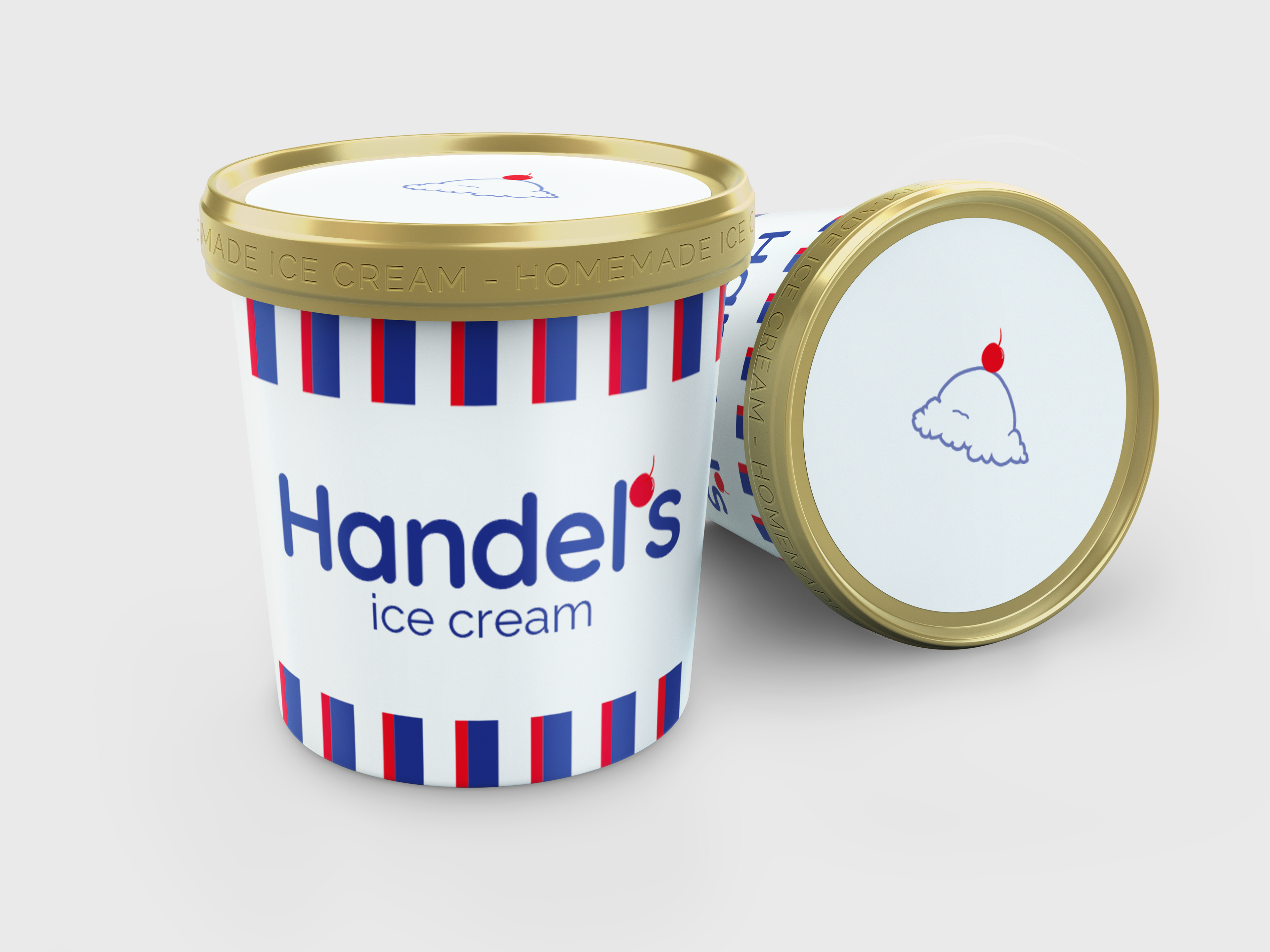
I chose to take on a self‑initiated rebrand of Handel’s Ice Cream. While the company has a strong heritage, I saw an opportunity to explore how its visual identity could evolve for a modern audience while still honoring its roots. This project allowed me to study an established brand, analyze its existing assets, and imagine how a refreshed identity could strengthen its presence in today’s competitive market.
Problem
The original Handel’s logo, while iconic, relies on detailed illustration and typography that feels dated. With many modern ice cream brands embracing bold, simplified visuals, Handel’s risks feeling out of step with current consumer expectations.
Goal
My goal was simple: reimagine Handel’s visual identity through an updated logo and packaging that balanced nostalgia with modernity. This included simplifying for better scalability, refining typography for a cleaner and more contemporary feel, and creating packaging that would stand out on shelves while still feeling unmistakably “Handel’s.”